MapScan
Turning flat map images into data I could actually combine.
I wanted to see what California looked like when forest, rainfall, elevation, geology, population, fire, and agriculture could be viewed together. The maps existed. Their data was trapped inside pixels.
Open the interactive mapI’ve always loved maps, data, and playing with the union of the two. In the past, when I wanted to compare maps, I composited them by hand in Photoshop. A transparent overlay was rarely enough. Each map used a different crop, scale, rotation, or projection, so I spent time warping and skewing the images until the coastlines looked approximately right.
Even then, the result was still a picture. I could not turn one tree type off, recolor a rainfall band, move geology behind population, or share a precise combination with someone else. The information was visible but not manipulable.
The question was simple: could AI recover the geography and the legend from a flattened image without reducing the fidelity of the original map?
Nine maps, nine different kinds of trouble.
I found maps I liked and gave them to Claude. Some were clean categorical diagrams. Others were dense, partial, textured, or layered with labels and boundaries. Click any image to inspect it.
Two loops: first geometry, then data.
I asked Claude to work backwards from the Mapbox map shape as a first step because it represents the final rendering. Alignment had to pass before extraction could begin; otherwise a perfect set of pixels would still be in the wrong place.
- 01
Read the image
Claude finds the map frame, the legend, the thematic marks, and the visual noise—labels, roads, borders, water, and background—that should not become data.
- 02
Work backwards from Mapbox
California’s coast, state boundary, and county geometry are rendered from Mapbox as the geographic reference. The source image is projected into that same pixel space.
- 03
Align, compare, repeat
Candidate projection, rotation, scale, skew, and local warp settings are scored against the reference. Comparisons run statewide and again at difficult edges such as the Bay Area and Colorado River.
- 04
Recover the legend classes
Legend labels and swatches become named classes. Pixels are classified at the source’s native resolution so the output preserves the original distinctions instead of tracing simplified shapes.
- 05
Diff, repair, publish
The extraction is flipped against the source and inspected at several zoom levels. Missing data, false colors, text holes, and spill outside California feed another iteration before Web Mercator tiles are published.
Bring the source to Mapbox.
Warp → compare to Mapbox → score → adjust ↻Transform, render, measure the perimeter, then try again.
Make the extraction match the source.
Extract → compare to source → diff → repair ↻Classify, flip, diff, repair—and preserve the aligned geography.
This was not a single prompt that produced a finished map. The system made a candidate, rendered evidence, measured what was wrong, changed its assumptions, and tried again. Fine coastline details, partial source extents, gradient colors, city labels, water, and overlapping legends all required different tests. The final product keeps each recovered legend item independently selectable. Datasets can be combined, reordered, recolored, and given their own opacity while Mapbox remains the live geographic canvas underneath.
Try the result
Build a map the source images could never make.
Select individual classes across datasets, change their colors and opacity, reorder the dataset stack, then copy a link to the exact composition.
Launch MapScanThe interesting part starts when the layers meet.
Here are some saved compositions make relationships across the recovered datasets easier to see. The data overlays aren't perfect, but I find it satisfying to be able to easily mix and match data sets. Google should probably build this at higher fidelity right into their products.
Example 01
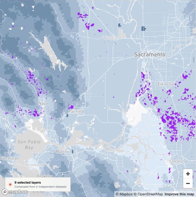
Grapes grow within particular elevation bands.
California’s grape-growing areas, shown in purple, cluster within particular elevation bands, shown in blue. The overlay makes the Central Valley, North Coast, and foothill patterns easier to compare than either source map alone.
Example 02
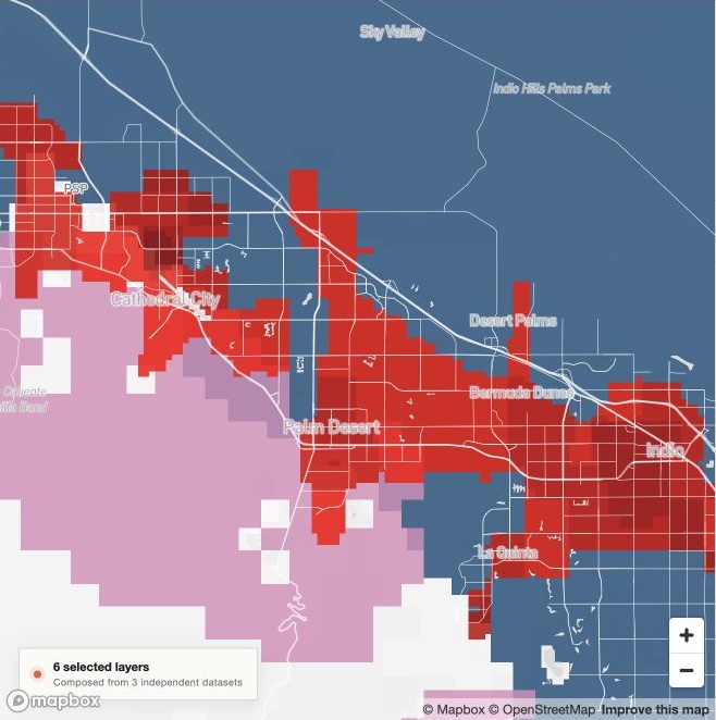
Palm Desert sits where dry and windy overlap.
One of the driest and windiest places where people live appears to be the Palm Desert area. The map combines 0–5 inches of annual rain, winds above 60 mph, and populated areas to make that overlap visible.
Example 03
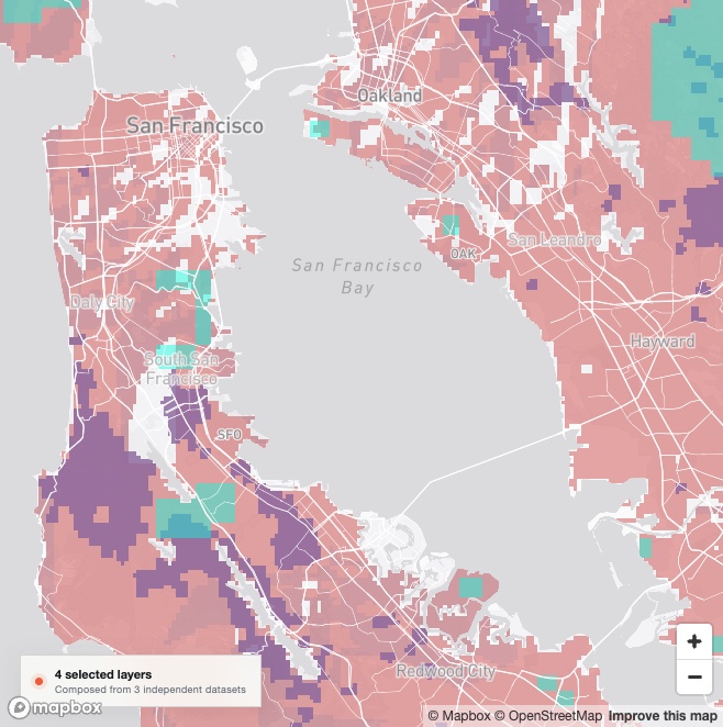
Some places face three overlapping hazards.
Very high fire hazard, extreme or devastating shaking risk from an earthquake, and high landslide susceptibility overlap across parts of the Bay Area. The composition makes this compound exposure visible in a way the individual maps do not.